Antz
-
Posts
59 -
Joined
-
Last visited
-
Days Won
2
Everything posted by Antz
-
Isn't 'nail to win' already prevented due to the fact that etherials are in this game?
-
Can pufu get admin so he can be more of a dev plz?
-
I like the new font, but I also think the little 'black backgrounds' to the pieces of the huds worked well too. I also think that everything shouldn't be spread out as much, like in the old hud : http://images.akamai.steamusercontent.com/ugc/577808217077938922/7A4B1F8EA401852F964B9D5950CDFAA438A4440B/
-
I like it, just please use another font :<
-
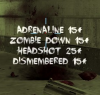
I think that the crate shop buying system only really works well with wave-based zombie survival...
-
For some reason I lost my grave digger suit + have my stalker suit (somehow) but can't de select or even see I have it in the menu I also lost my rambo suit too :C
-
This happens when you turn up your weapon_fov on the menu, it shouldn't go this far but the option (to change the weapon_fov) should be available for all of the weapons.
-
Okay, Thanks Duby, i'll see if it works.
-
Is there anyway to customize the music like we could before? I remember you could change the music in the sound files and have what you wanted.
-
will be gone for a long time :C
-
You are trying to get them banned for telling the zombies to kill you?
-
Does any one know what's going on with the zombie survival?